Plotting Trends in Labor Participation
Just for some additional thoughts on the politically charged Labor Participation Rate, I wanted to tease out some trends that help explain some of the numbers. As I remarked in the prior posts on this subject, we see a substantial decline in the participation rate for Men, (blue line) which was scraping 90% back in 1950, and has trended down since. The rate for Women (red line) went from the mid 30s range and almost, but not quite doubled to about 60%. What is interesting here are two plot lines, one for the young, and one for the (cough) old. What led me to explore this was an article from the June 2013 issue of The Atlantic Magazine, noting the high school graduation rate had hit a record high- almost 75%. And that would go aways towards explaining the steady decline shown in the 16 - 19 year age cohort we see mapped above. Now the good people at the Federal Reserve of St. Louis, who keep the economic geeks busy, plot out LPR at all kinds of levels: age, race, gender, education levels, and so on. One chart they are missing is for the "Age 20 and over" bracket. Almost all commentators quote LPR as an "All In" figure, which includes the Age 16 - 19 cohort. Which is a shame, because it presents a different picture. Absent a chart, I contacted the Bureau of Labor Statistics, which had the LPR statistics for age "20 and older" at the ready.
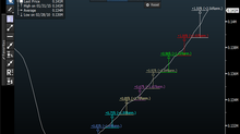
Remember this Bloomberg Graph?
Note the peak for "all in" LPR at the beginning of the year 2000, which is recorded at 67.3% Note the decline to the current (December 2014) rate of 62.7.
If we take out the 16 - 19 cohort, which was eroded by higher high school graduation rates (and presumes some level of higher education as well) the BLS reports that LPR for the 20 and over crowd hit 68.5% in the January 2000 period.
But most telling is the CURRENT of Labor Participation of the same group: 64.7%, not the oft quoted 62.7%, which is what it is dragged down to when we add the teens in. So the spread between the two methods is wider today than it was back when Labor Participation was at it's zenith. And surprisingly, the 55 and over cohort has trended substantially upwards since the 2000 zenith. Perhaps there aren't as many people "aging out" of the workforce as many presumed, and a good deal of this is because people haven't aged IN.
It's interesting what you can find once you rely on the data, and take the emotion of politics out of this.


