EPOP Update
Just a follow up on the Employment to Population Ratio, which I believe is the correct way to gauge employee engagement in the labor force. And here is the chart, starting from the top, Prime Age (25-54), then all in, (green), to the 16-19 cohort, (blue) to the age 65+ group down at the bottom.

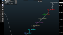
Those looking to benchmark from the Pre-COVID lockdown period will find a few things to chew on. From February 2020 to December 2022, the age 16-19 cohort jumped from 32.5 to 33.1%. This strength is also reflected in wage gains for the group: (Note chart covers 16-24)

For the most telling age cohort, the "Prime Age" 25-54 segment, we stood at an 80.5% rate in February 2020 and slipped a bit to the current 80.1%.
For the age 65+ segment, here's the story about a boomer workforce aging out of the economy, and it's sagged from 25.2% down to 23.1%, which is a substantial move. And that's why using the Labor Force Participation Rate is so deceptive, if not downright dishonest.
Keep in mind that these numbers are not completely static up OR down, and there is always some "noise" in the data, so the end points, by themselves, don't tell you the whole story. However, the big takeaway is that the age 65+ cohort seems to have fallen down and can't get up, unlike the other age cohorts which have regained or even exceeded a fair amount from their initial "COVID shock" declines.
So no matter what metric you use, the shifting demographic patterns are the key to understanding worker engagement. Hopefully, parsing the data with a little more than a cursory glance, or just reading the data like a basketball score will provide a clearer view into the real state of our labor markets.
January 23, 2023


